Letters in Motion
How a tiny Markov model turned into a curious lens on writing style
Visualizing Character Transitions in Public‑Domain Texts
These days, the Austrian poet Ernst Jandl would have turned 100. One of his poems is called schtzngrmm. In it, Jandl describes life in a trench during the war — but he does so without using a single vowel. Only hard consonants remain, and when you read them aloud, they sound like gunfire.
Thinking about this poem led me to a small experiment of my own. I wondered what would happen if I looked at texts in a similar way — not at their meaning, but at the way their letters follow each other. Could this pattern tell us something about a writer’s style, or even about the language itself?
To explore this, I used a simple model called a Markov chain. It is an approach that looks at one step at a time: each new step depends only on the step before it. Applied to text, this means counting how often one letter follows another, and then turning these counts into a kind of map.
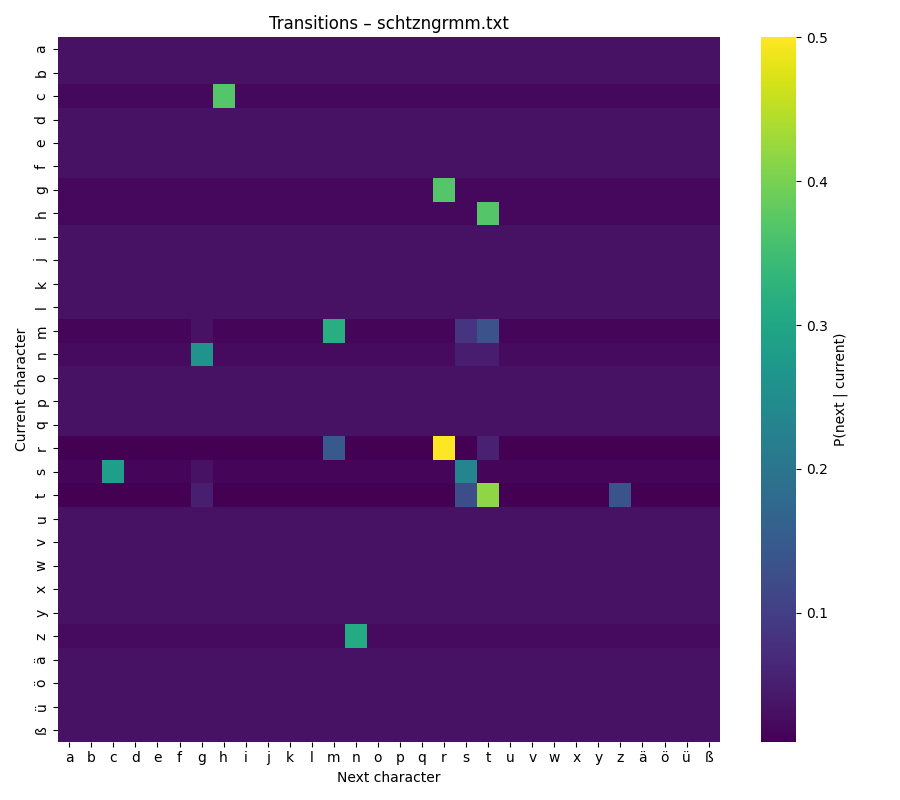
Take any text. Count how often one letter follows another. Visualize the result as a heat‑map.
There is no deep learning here, no hidden layers or heavy algorithms — just simple counts turned into probabilities. The result feels like a small fingerprint of the text. What started as a quick scratch in my notebook turned into a tool I now like to keep in my craft toolbox.
In this article I’ll show you how the tool works, why the visual matters, and what patterns emerged from my first comparisons.
Build – the minimal core
The whole tool fits in just a few lines of Python. The idea is simple:
- Take the text.
- Normalize it (lowercase, consistent alphabet).
- Count how often each letter follows another.
- Turn those counts into probabilities.
- Draw a heat‑map.
Here is the core of the code:
alphabet = list("abcdefghijklmnopqrstuvwxyzäöüß")
index = {ch: i for i, ch in enumerate(alphabet)}

# Start with ones instead of zeros (Laplace smoothing)
counts = np.ones((len(alphabet), len(alphabet)), dtype=int)

for a, b in zip(text, text[1:]):
  if a in index and b in index:
    counts[index[a], index[b]] += 1

matrix = counts / counts.sum(axis=1, keepdims=True)
Choosing the alphabet
I started with the basic Latin alphabet and added German characters like ä, ö, ü, ß. This matters if you compare texts across languages: without a fixed alphabet, the axes of the heat‑map shift and comparisons become messy.
Laplace smoothing – why the “+1”?
Before turning counts into probabilities, I add 1 to every cell in the matrix. This is called Laplace smoothing. It avoids empty cells: in any real text there will be combinations of letters that never occur, such as q → z in English. Without smoothing, their probability would be exactly zero, leaving blank spots in the heat‑map.
Adding one gives each possible combination a tiny baseline probability. This does not change the main patterns — frequent transitions still stand out — but it makes the matrix more complete and the visualization smoother. It also helps later, if you want to generate new text from the matrix: with smoothing, no combination is “forbidden” by accident.
Probabilities instead of counts
Finally, I turn the counts into probabilities by dividing each row by its sum. This means every row (every “current letter”) adds up to 1. The color scale in the heat‑map now reflects relative likelihood, not absolute frequency, so two texts of different lengths can still be compared.
Visualize – reading the heat‑map
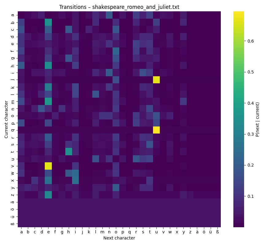
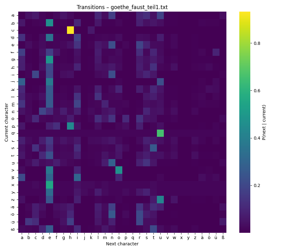
Once the matrix is built, the easiest way to explore it is with a heat‑map. Each row represents the current letter, each column the next letter. The color shows how likely this transition is:
- Bright yellow → very common
- Dark purple → rare or almost absent
Keeping the same color scale for all texts is important. It allows the eye to compare them directly: bright patches in one heat‑map mean the same thing as bright patches in another.
Looking at the map is surprisingly intuitive. You can scan along the diagonal and see how often letters repeat themselves (like e → e). You can spot common clusters, such as t → h in English (“the”) or c → h in German (“ch”). The patterns become small signatures of a language or even an author’s style.
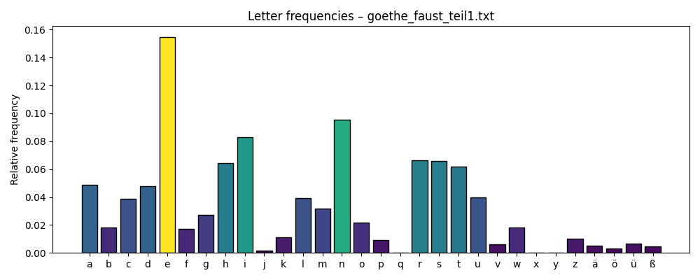
In addition to the heat‑map that shows how characters follow one another, I also created two more visualisations. A chart of overall letter frequencies and a list of the top ten words in each text. These extra views add useful context when interpreting the heat‑map.
Text samples
There are plenty of resources for getting plain text. One of the most elaborate database is Project Gutenberg is a library of over 75k free books. I selected some well known books in German and English for my analysis: R. Descartes, Grundlagen der Philosophie (de), J. Goethe, Faust Teil 1 (de), A. Schnitzler, Reigen (de), E. Jandl, Schtzngrmm (de), F. Schiller, Die Räuber (de), T. Mann, Der Tod in Venedig (de), W. Shakespeare, Romeo and Juliet (en), H. Melville, Moby Dick (en), J. Swift, Gulliver’s Travels (en).
Observe – first patterns
My observations are not scientific; they are more like small hints — curiosities that invite further exploration. Still, even in this first round, some patterns stood out:
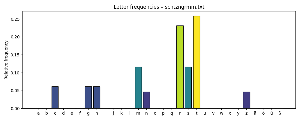
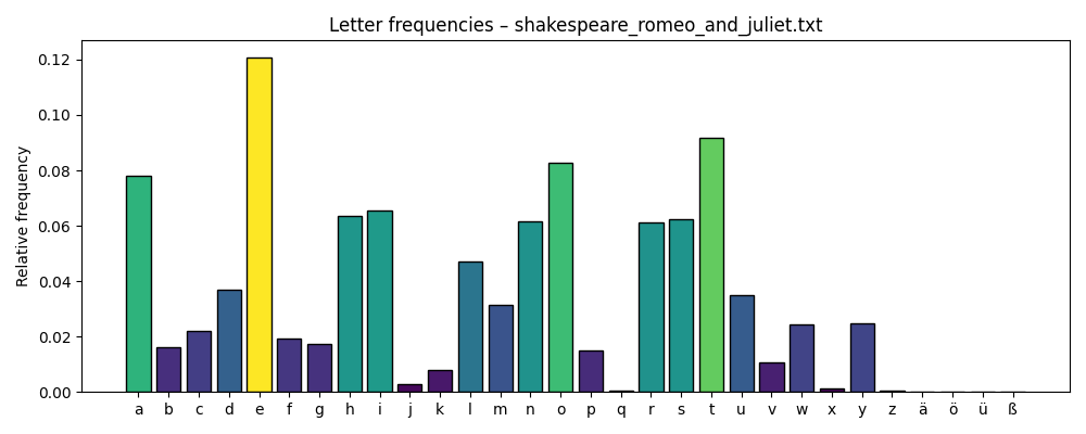
- The letter “e” is the most frequent in almost every text — both in German and English — with the only exception being Jandl’s Schtzngrmm.
- “e” is also the most common follower letter; it often appears after many different characters.
- Consonant clusters are highly language‑specific and easy to spot. In German you often see ch, while English texts highlight qu, th, or wh.
- The most dominant words are function words — small connecting words such as the, der, is, a.
Examples
Schtzngrmm
Romeo and Juliet
Faust - Teil 1
Are these insights useful? Maybe. They are certainly not academic findings — but they spark curiosity and suggest directions for deeper exploration.
Reflect – limits and next steps
This method looks only one step ahead — each letter transition depends solely on the letter before it. That is fine for a small experiment, but language unfolds in phrases and patterns that stretch over several words. Those longer structures remain invisible here.
Another limitation comes from smoothing. By adding one to every possible transition, rare letters like x or ß get pulled toward the middle. They don’t disappear, but their unique patterns can be harder to see. If those letters matter, a log‑scaled heat‑map or a focused zoom might help.
While this first version works well for letters, there are many ways it could grow. One idea is to shift the focus from letters to words. By looking at how words follow each other, patterns of sentence structure might appear — articles, verbs, nouns forming rhythms that letters alone cannot show.
Another extension would be to make the tool interactive. A small web panel, built for example with Streamlit, could let you hover over cells in the heat‑map and immediately see example words or passages that use this transition. It would turn the static plot into something you can explore.
And finally, the same method could step beyond text. The logic of transitions applies just as well to music: notes or chords replacing letters, melodies instead of sentences. It would be fascinating to compare genres — pop, jazz, orchestral — and see whether musical “fingerprints” emerge in the same way.
Share – code & conversation
The code for this experiment lives on GitHub: markov-heatmap
If you try it yourself, I’d be curious to see what you discover. Maybe your heat‑maps reveal patterns I haven’t noticed yet. Feel free to share screenshots, observations, or even improvements to the code.
And if you enjoyed this article, consider subscribing — more small experiments like this one are on the way.